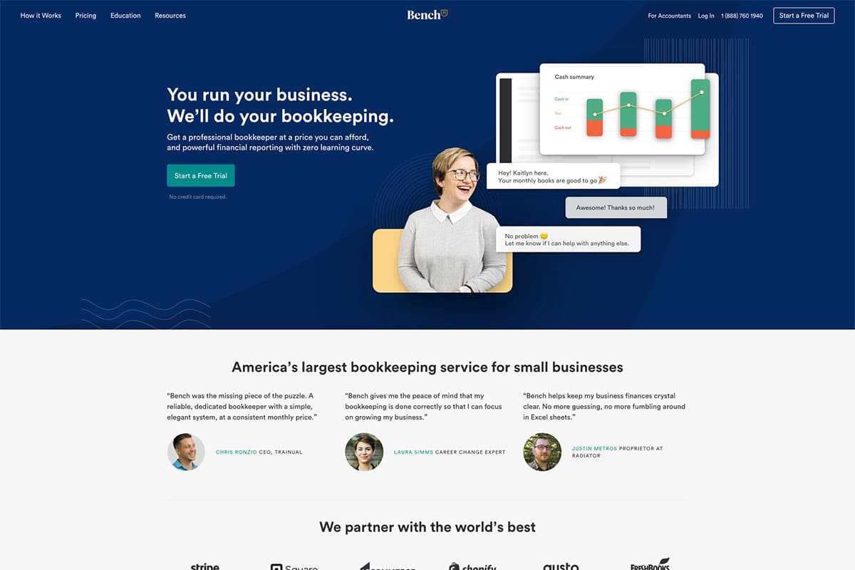
Why Does Color Psychology Matter in Website Design?
Build Credibility: Colors like blue and gray are often associated with reliability and professionalism.
Encourage Engagement: Vibrant accent colors can guide users’ attention and drive actions such as filling out contact forms or booking consultations.
Enhance User Experience: A harmonious color scheme ensures readability and visual appeal, making visitors more likely to stay and explore.
Key Colors and Their Psychological Impact
Blue: The most popular choice for accounting websites, blue conveys trust, stability, and competence. It helps clients feel secure about entrusting your firm with their finances.
Green: Often associated with growth and prosperity, green can subtly reinforce themes of financial success and sustainability.
Gray: This neutral color reflects balance and professionalism, making it a great complementary color for a sophisticated look.
White: A clean and minimalist background promotes clarity, which is crucial for showcasing information clearly.
Accent Colors (Orange, Yellow): Used sparingly, these colors can draw attention to calls-to-action (CTAs) like “Contact Us” or “Schedule a Consultation.”
Best Practices for Incorporating Color Psychology
1. Align Colors with Your Brand Identity
Ensure the color palette reflects your brand’s personality. For instance, if your firm’s values center on innovation, consider a modern combination of blue and green with sleek accents.
2. Focus on Readability
Avoid color combinations that strain the eyes. A high-contrast pairing, such as dark text on a light background, enhances readability and keeps visitors engaged.
3. Use Accent Colors Strategically
Highlight important elements like buttons or headings with vibrant accent colors. This improves navigation and encourages user interaction.
4. Test User Preferences
Run A/B tests with different color schemes to identify what resonates most with your target audience. Preferences can vary based on demographics and industry norms.
Examples of Effective Color Use
A prominent accounting firm’s website might feature a blue-and-white color scheme, with subtle gray elements for balance. Blue headers, white backgrounds, and gray navigation menus convey trustworthiness and simplicity.
2. Green for Financial Growth
For firms focusing on wealth management or eco-conscious practices, integrating green as a primary or secondary color can underline themes of prosperity and sustainability.
3. Orange CTA Buttons
An orange “Get Started” button against a blue background grabs attention while maintaining professionalism. This tactic subtly nudges users toward taking action.
Common Mistakes to Avoid
Too many colors can overwhelm visitors and dilute your message. Stick to 2-3 primary colors for a cohesive design.
2. Ignoring Accessibility
Ensure your color choices meet accessibility standards. For example, text over a background color should have sufficient contrast for readability.
3. Neglecting Cultural Contexts
Colors hold different meanings across cultures. If your firm serves a global audience, consider cultural perceptions when finalizing your palette.
Conclusion
Ready to transform your accounting firm’s website? Harness the power of color psychology today and make a lasting impression!

